The charm of early 20th century reloaded.
The wooden facade stands out with carved details in bright white all the way up to the gable, while black window frames add a modern counterpoint. The front door, painted signal red, invites you to step into the historic townhouse, which has the same colour palette on the inside as it does on the outside. A kitchen from Poggenpohl forms the heart of the building. It effortlessly connects the living and dining areas.
Noe Valley has a friendly and familiar feel. The city district in San Francisco is known for its countless sunny days. The hilly quarter, which has retained its original character, is especially popular with young families. The freestanding Victorian-era townhouses contribute to the cosy atmosphere. Once built with lots of small rooms for a growing workforce, they are in need of a thorough update to keep up with modern lifestyles and living concepts.
The owners of this gem, built in 1900 in Dolores Heights, had a clear vision for the renovation: lots of natural light and an open plan would transform the house into a home for the family of four. The fully renovated building spans four floors, three of which are lived on.
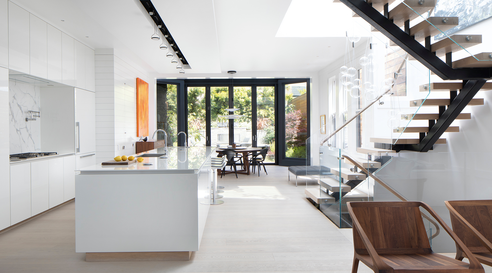
The open staircase dynamically winds across all four floors. In the main living space, the eye is drawn through the entire depth of the house, and double-wing doors open from the dining area onto the garden. Like the rest of the house, the colour scheme is dominated by white. Dark and black elements, as well as light woods, form a balanced contrast. Artwork brings motion and colourful accents into play.
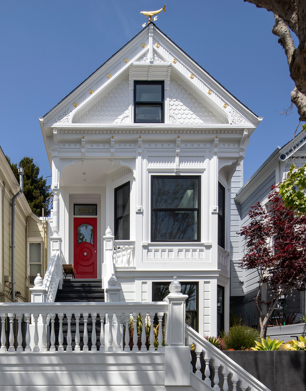
The newly built steps outside the house lead directly from the street to the red front door, three floors high.
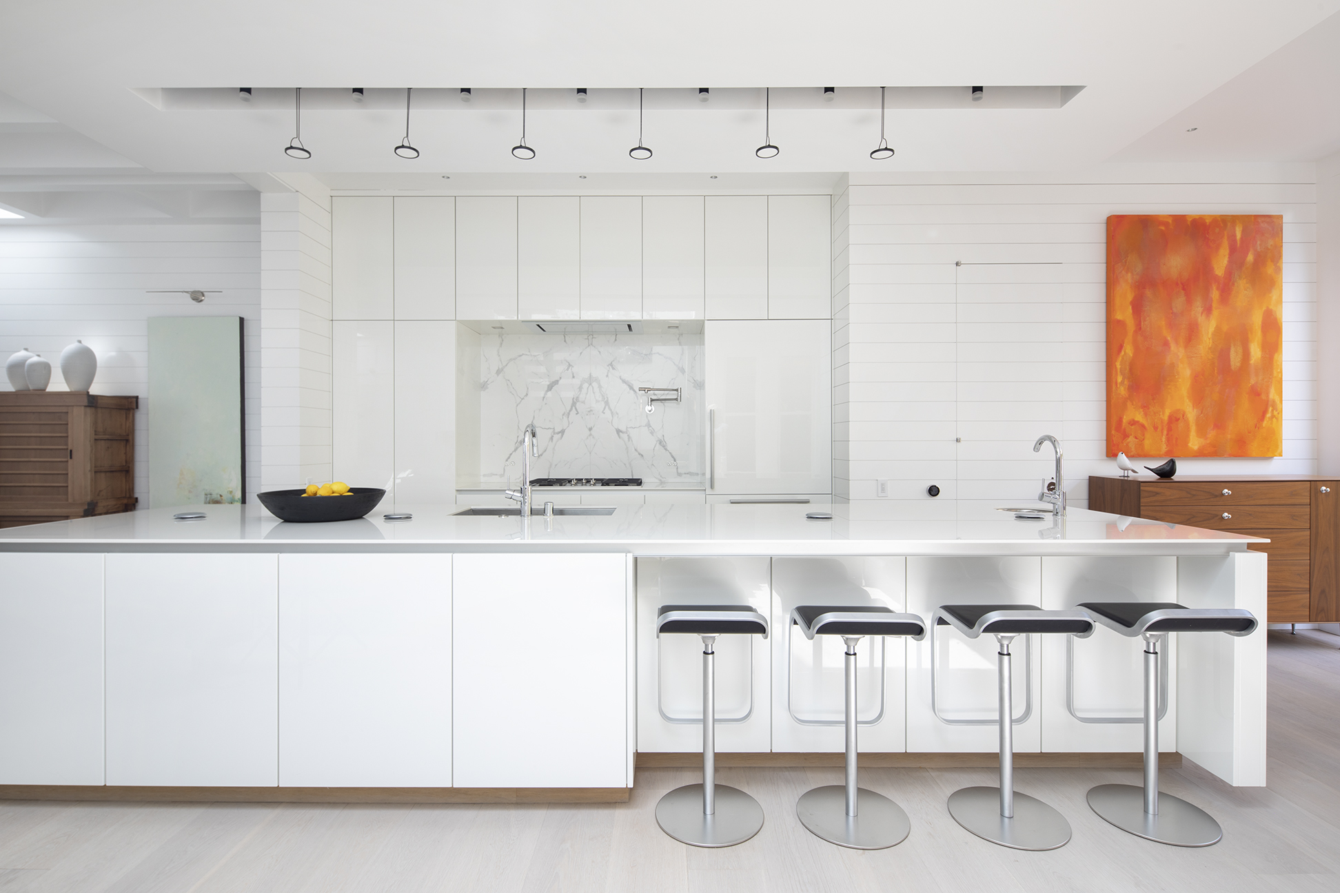
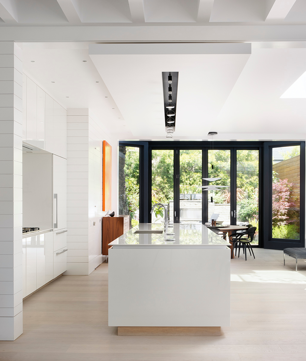
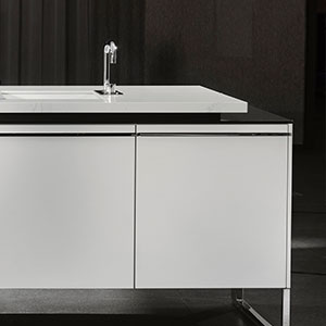
The Poggenpohl +SEGMENTO kitchen is the shining centrepiece of the living area on the ground floor. Elegant and extremely linear in style, it connects the living and dining area.
The kitchen is in the centre of the ground floor, unmissable and full of verve. With a high-gloss finish in polar white, the +SEGMENTO seamlessly blends into the light interior decor. The design process took more than a year; interior designer Ric Pulley and the kitchen architects at Poggenpohl were still working on the details until recently.
The long, linear worktop with two large basins is installed flush. The seating niche of the kitchen island invites guests to linger a moment, or to sit and watch as food is prepared. Behind it, floor-to-ceiling cabinets frame the marble-clad cooking area. A neat trick reinforces the clean overall image: the kitchen appliances are concealed behind the cabinet doors.
Behind the long kitchen island and dining area, the eye is drawn into the garden. A painting in bright orange hangs impressively on the side wall.
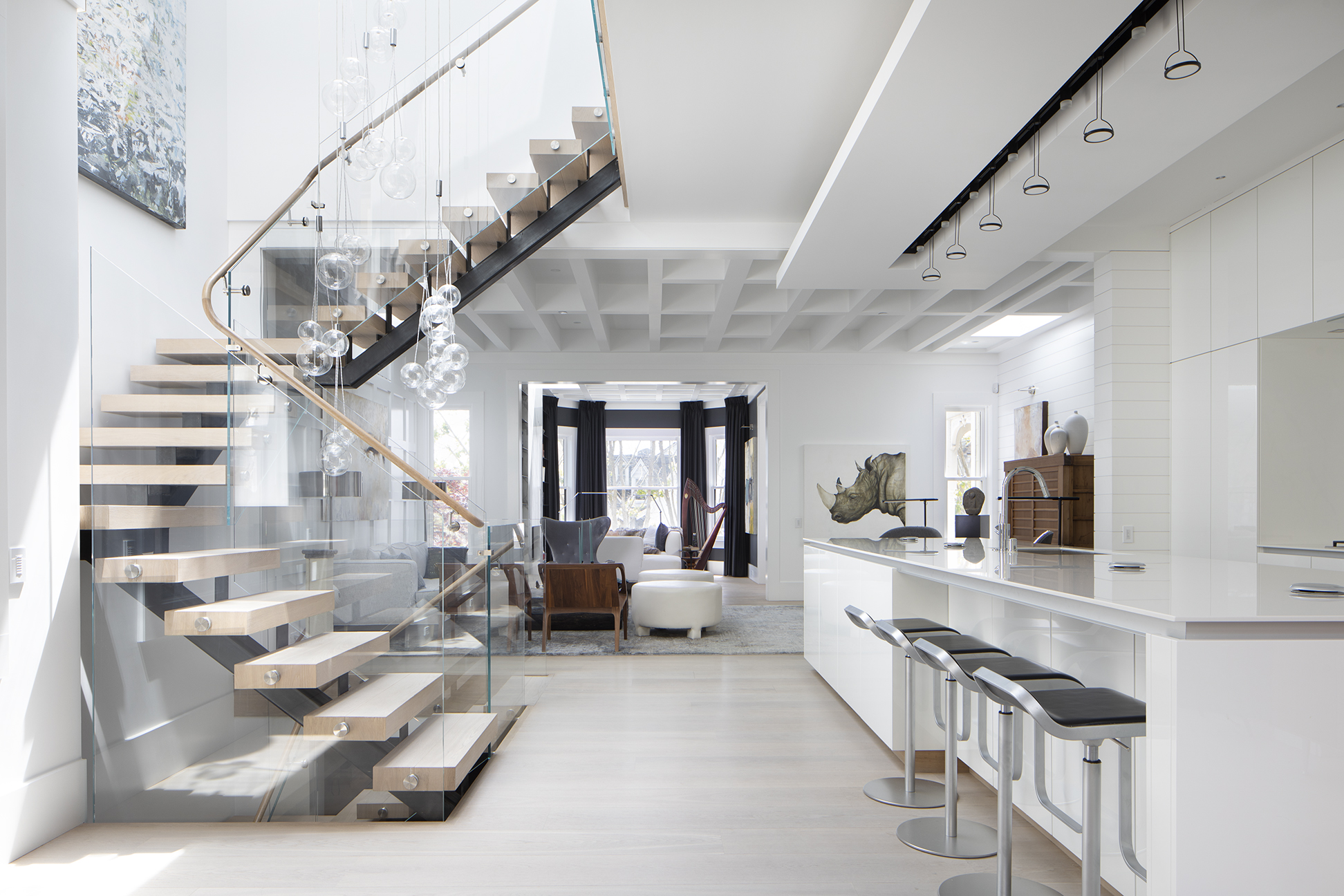
The curved staircase leads from the entrance level directly to the heart of the home: the +SEGMENTO kitchen in high-gloss polar white. The entire living area is decorated in a light colour concept with carefully placed colour accents.



.jpeg)
